Styling your site
Beta feature. Site Builder is in active development. Some controls are still being refined and templates are being expanded. We’d love your feedback — use the Submit feedback link in the Site Builder header.
The Styles panel on the right side of the editor controls site-wide design. Set a colour or font here and every block that uses it updates everywhere — no need to edit each page.
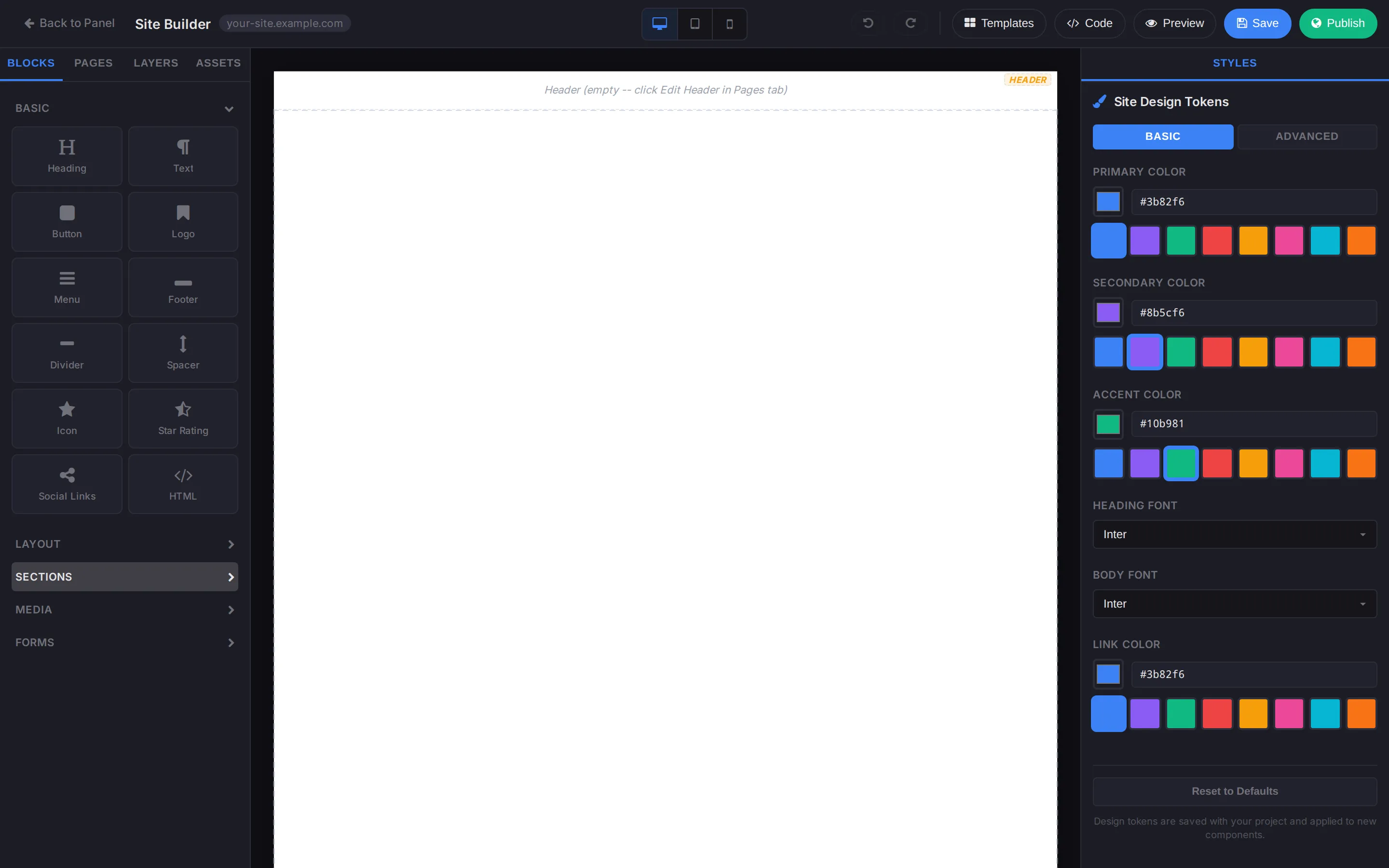
Site Design Tokens (Basic)
Section titled “Site Design Tokens (Basic)”The default Basic view exposes the most common controls:
- Primary Color — used for buttons, accents, and important highlights.
- Secondary Color — used for secondary buttons, hover states, and supporting accents.
- Accent Color — used for callouts, badges, and small decorative touches.
- Heading Font — applies to all heading blocks (H1–H6).
- Body Font — applies to paragraph text and other body copy.
- Link Color — used for inline links inside text blocks.
Each colour has a hex input plus an eight-swatch quick-pick row (a curated palette of vibrant brand colours). Click a swatch to apply it, or paste your brand hex into the input.
Advanced
Section titled “Advanced”Click Advanced in the Site Design Tokens header to expose finer controls:
- Extended palette — backgrounds, surfaces, borders, muted text, and inversions for dark sections.
- Type scale — adjust the relative size between H1–H6 and body text.
- Spacing scale — tune the default padding and margin used by sections and containers.
If you make a mess, click Reset to Defaults at the bottom of the panel — it restores the original token set without touching your content.
Per-block overrides
Section titled “Per-block overrides”The tokens above are the default for the whole site. When you need a single block to deviate (a one-off red CTA, for instance), select that block on the canvas; its block-settings panel on the right has its own colour controls that take precedence over the site tokens.
Use per-block overrides sparingly. The point of tokens is consistency — if you find yourself overriding the same value on every block, change the token instead.
Picking fonts
Section titled “Picking fonts”The Heading and Body font dropdowns include a curated list of web fonts. If you need a font that isn’t in the list:
- Add a
<link>to the font’s CSS via Custom head code. - Type the font’s exact family name into the font picker.
The dropdown is forgiving about custom names — anything you type will be applied as the font-family.
Live preview at different widths
Section titled “Live preview at different widths”The desktop / tablet / mobile toggles at the top of the editor switch the canvas viewport. Layout decisions (column counts, padding, font size) often look fine at one width and break at another — switch through all three before publishing.
Related
Section titled “Related”- Blocks & pages — what the tokens apply to.
- Publishing & code injection — add a custom font via
<head>.
Still stuck?
Section titled “Still stuck?”Still stuck? Open a support ticket and our team will help.